Steven, please fix the 1% loss/gain graph!
Back in December 2023, I got curious about Steven Bartlett's then-new book The Diary of a CEO: The 33 laws of business and life and ordered a copy for myself. I dived right in. On page 184 this graph hit me:
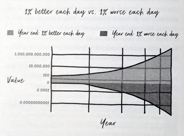
It is meant to be about how 100 USD develop over time with either constant 1% loss or 1% gain per day.
It puzzles and amazes me to this day how this graph — with all the things wrong about it, even for a schematic graph — made its way into a published book: It feels unreal. In particular:
-
The loss curve is "bending the wrong way": It is presented as concave when it should be convex.
-
The placement of 0 (zero) on the Y-axis is wild.
-
The graph has a log scale but seems to want to still live in the linear world.
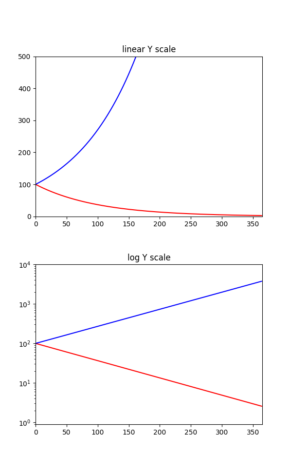
Here is what that graph could have been with matplotlib (source code Gist in Python), either with a linear scale or with a truly logarithmic scale:
For comparision, here is how James Clear, the author of the book Atomic Habits, turns this into a working schematic graph for an article of his:
Steven, if you read this, please fix the 1% loss/gain graph for the next edition of the book — thank you!
-- Sebastian Pipping